
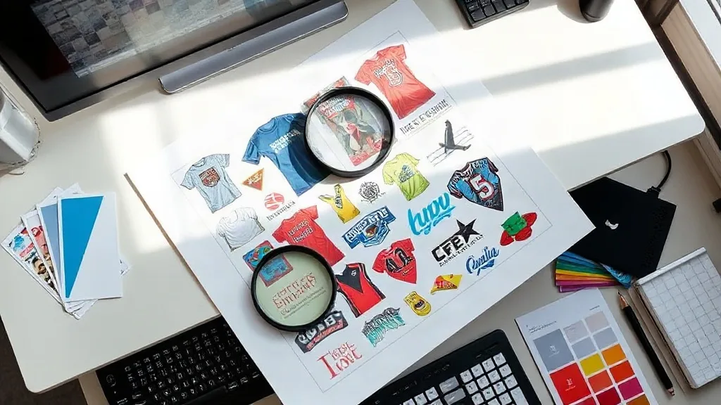
You can own a well-tuned DTF printer, load fresh film, and shake the powder perfectly, and still pull a sheet that looks soft, bled, or muddy. In most cases the culprit is not the press. It is the artwork that went into the DTF Gangsheet before the first drop of ink hit the film. File preparation is the quiet step that decides whether a gangsheet saves you money or quietly burns it, one rejected transfer at a time.
This guide is about the decisions you make in your design software, not on the printer. We will walk through resolution, transparency, bleed and spacing, color handling, and the small habits that keep a busy shop from reprinting the same job twice.
Start With the Right Resolution Before Anything Else
DTF printing is unforgiving about low-resolution art. A design that looks acceptable on a monitor at 100 percent zoom can turn into a fuzzy edge once it is printed at 10 inches wide and pressed onto a cotton tee. The common rule of thumb is to build your artwork at 300 DPI at the final print size. That means if a logo will print at 9 inches wide, the source file should genuinely support 300 DPI at 9 inches, not 300 DPI at 3 inches scaled up.
Vector files make this easy because they scale without losing sharpness. Raster files need checking. Open the image properties and confirm the pixel dimensions match your intended print size. A 1,200-pixel-wide graphic printed at 12 inches gives you 100 DPI, and that will show. If a client sends a small logo pulled from a website, ask for the original vector or a higher-resolution export before you commit it to a sheet.
Why upscaling rarely rescues a bad file
Automatic upscalers can smooth jagged edges, but they invent detail that was never there. Text and fine lines often end up soft or slightly warped. For a name or a small tagline on a gangsheet, that softness is visible on the finished garment. When a file is genuinely too small, the honest move is to request better art or reduce the intended print size.
Transparency and Backgrounds: The Part That Trips People Up
DTF transfers need a clean transparent background. The printer lays white ink behind your design, and that white layer follows the shape of your artwork. If your file carries a white box behind a logo, the transfer will include that box, and it will show as a pale rectangle on a dark shirt.
Flatten your design onto a transparent canvas and check the edges closely. A common trap is a design that looks transparent in the editor but actually has a near-white background, like a very light gray from a screenshot. Zoom in and inspect the corners. Genuine transparency shows a checkerboard pattern, not a solid color.
- Save as PNG with an alpha channel, or send a layered file your RIP software can read.
- Delete hidden layers and stray anchor points that might print as specks.
- Check for semi-transparent shadows and glows, which can print as faint halos.
Bleed, Spacing, and Nesting on the Sheet
Spacing is where a gangsheet layout earns or loses its efficiency. Transfers need a small gap between them so the cut lines stay clean and the film does not tear when you separate pieces. A gap of roughly 0.1 to 0.2 inches between designs is a practical starting point for most shops, though your cutter and film width may call for slightly more.
Nesting is the art of arranging different sizes so the sheet wastes as little film as possible. Rotate pieces where the design allows, tuck small items into the empty corners left by large ones, and group jobs that share the same film width. A sheet packed with tight nesting can fit noticeably more transfers than one laid out in neat rows, and that difference adds up across a week of orders.
Leave a small margin around the outer edge of the sheet as well. Designs that run right to the border can get clipped by the printer's platen or the cutter's registration marks.
Color: What You See Is Not Always What Prints
DTF printing uses CMYK inks plus white, and the gamut is narrower than what your monitor displays. Bright neons, deep saturated blues, and certain greens often shift once printed. It helps to keep a printed color reference on hand so you can compare screen colors to real output, especially for repeat clients who expect consistency.
Rich blacks deserve special attention. A pure 100 percent black can print flat, while a build that mixes in some cyan, magenta, and yellow can look deeper. Test on your own setup rather than assuming, because ink, film, and powder all influence the final result.
White ink and fine detail
The white underbase is what makes DTF work on dark fabrics, but it can also cause problems with very fine lines and small text. Extremely thin strokes may fill in slightly. If a design has delicate linework, consider thickening it by a fraction of a point or testing a small sample before running the full sheet.
Building a Repeatable File Checklist
Shops that rarely reprint tend to follow the same short checklist every time a file enters the queue. It takes a couple of minutes and prevents most of the expensive mistakes.
- Confirm the print size and resolution match.
- Verify the background is truly transparent.
- Check spacing between pieces and the outer margin.
- Review color against a printed reference.
- Preview the full sheet in your RIP software before sending it to print.
That last step catches more errors than any other. The RIP preview shows exactly how the white layer and colors will be laid down, including anything that slipped through in your design software.
Where File Prep Pays Off
A well-prepared DTF Gangsheet is not just about avoiding reprints. It also lets you pack more onto each sheet, which lowers your cost per transfer and keeps turnaround fast when orders stack up. The design file is the first place those savings are won or lost. Get the resolution, transparency, spacing, and color right, and the rest of the workflow tends to fall into place.
Frequently Asked Questions
What resolution should a DTF gangsheet file be?
Aim for 300 DPI at the final print size. Vector files scale cleanly, but raster images need to have enough pixels to support that resolution at the width you intend to print.
How much space should I leave between designs on a gangsheet?
A gap of about 0.1 to 0.2 inches between pieces is a practical baseline. Increase it if your cutter needs more room or if the film tends to tear during separation.
Why does my transparent PNG still print with a white box?
The file likely has a near-white background rather than true transparency. Zoom in to check for a checkerboard pattern, and confirm you are exporting with an alpha channel.
Can I print very small text on a DTF transfer?
Small text is possible, but very thin strokes may fill in slightly because of the white underbase. Thicken delicate linework a little and run a small test before committing to a full sheet.